Green
Visualized: Historical Trends in Global Monthly Surface Temperatures (1851-2020)
View the full-resolution version of this infographic
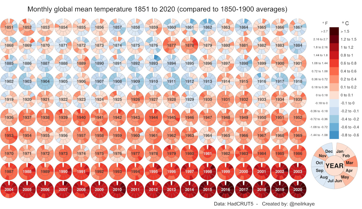
Global Temperature Graph (1851-2020)
View the high-resolution of the infographic by clicking here.
Since 1880, the Earth’s average surface temperature has risen by 0.07°C (0.13°F) every decade. That number alone may seem negligible, but over time, it adds up.
In addition, the rate of temperature change has grown significantly more dramatic over time—more than doubling to 0.18°C (0.32°F) since 1981. As a result of this global warming process, environmental crises have become the most prominent risks of our time.
In this global temperature graph, climate data scientist Neil R. Kaye breaks down how monthly average temperatures have changed over nearly 170 years. Temperature values have been benchmarked against pre-industrial averages (1850–1900).
What is Causing Global Warming?
The data visualization can be thought of in two halves, each reflecting significant trigger points in global warming trends:
- 1851-1935
Overlaps with the Second Industrial Revolution
Low-High range in global temperature increase: -0.4°C to +0.6°C - 1936-2020
Overlaps with the Third Industrial Revolution
Low-High range in global temperature increase: +0.6°C to +1.5°C and up
The global temperature graph makes it clear that for several years now, average surface temperatures have consistently surpassed 1.5°C above their pre-industrial values. Let’s dig into these time periods a bit more closely to uncover more context around this phenomenon.
Industrial Revolutions and Advances, 1851–1935
An obvious, early anomaly on the visual worth exploring occurs between 1877–1878. During this time, the world experienced numerous unprecedented climate events, from a strong El Niño to widespread droughts. The resulting Great Famine caused the deaths of between 19–50 million people, even surpassing some of the deadliest pandemics in history.
In the first five rows of the global temperature graph, several economies progressed into the Second Industrial Revolution (~1870–1914), followed by World War I (1914-1918). Overall, there was a focus on steel production and mass-produced consumer goods over these 80+ years.
Although these technological advances brought immense improvements, they came at the cost of burning fossil fuels—releasing significant amounts of carbon dioxide and other greenhouse gases. It would take several more decades before scientists realized the full extent of their accumulation in the atmosphere, and their resulting relation to global warming.
The Modern World In the Red Zone, 1936–2020
The second half of the global temperature graph is marked by World War II (1939-1945) and its aftermath. As the dust settled, nations began to build themselves back up, and things really kicked into hyperdrive with the Third Industrial Revolution.
As globalization and trade progressed following the 1950s, people and goods began moving around more than ever before. In addition, population growth peaked at 2.1% per year between 1965 and 1970. Industrialization patterns began to intensify further to meet the demands of a rising global population and our modern world.
The Importance of Historical Temperature Trends
The history of human development is intricately linked with global warming. While part of the rise in Earth’s surface temperature can be attributed to natural patterns of climate change, these historical trends shed some light on how much human activities are behind the rapid increase in global average temperatures in the last 85 years.
The following video from Reddit user bgregory98, which leverages an extensive data set published in Nature Geoscience provides a more dramatic demonstration. It looks at the escalation of global temperatures over two thousand years. In this expansive time frame, eight of the top ten hottest years on record have occurred in the last decade alone.
Global warming and climate change are some of the most pressing megatrends shaping our future. However, with the U.S. rejoining the Paris Climate Agreement, and the reduction of global carbon emissions highlighted as a key item at the World Economic Forum’s Davos Summit 2021, promising steps are being taken.


Green
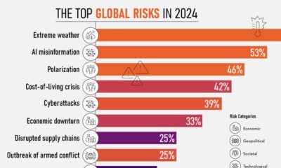
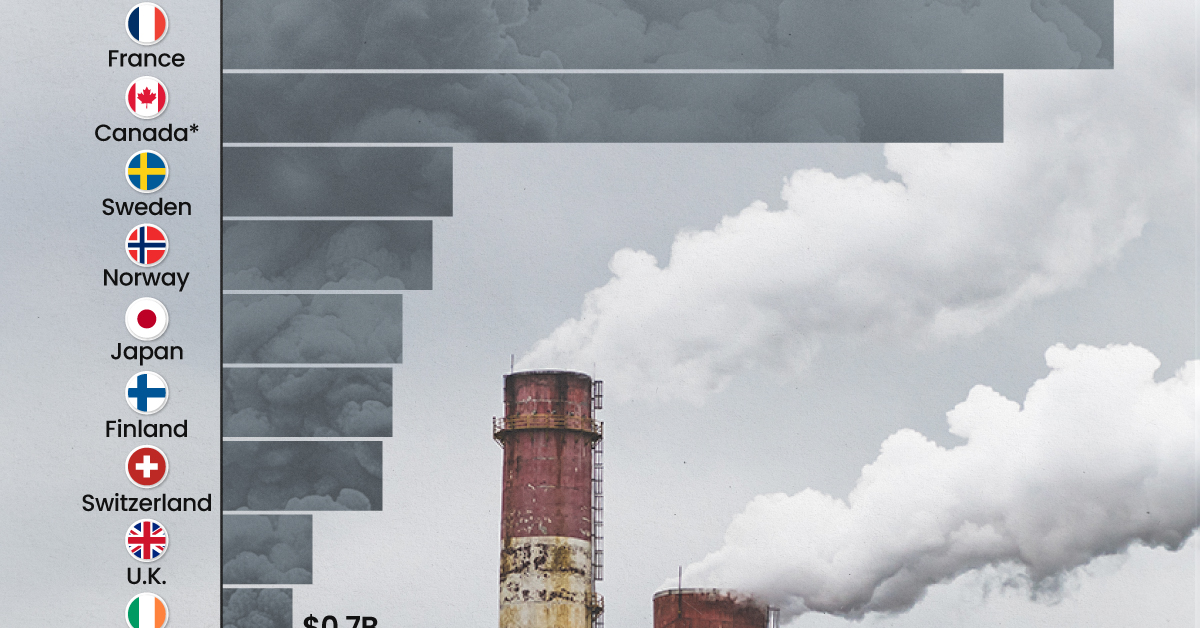
Ranking the Top 15 Countries by Carbon Tax Revenue
This graphic highlights France and Canada as the global leaders when it comes to generating carbon tax revenue.
Top 15 Countries by Carbon Tax Revenue
This was originally posted on our Voronoi app. Download the app for free on iOS or Android and discover incredible data-driven charts from a variety of trusted sources.
Carbon taxes are designed to discourage CO2 emissions by increasing the cost of carbon-intensive activities and incentivizing the adoption of cleaner energy alternatives.
In this graphic we list the top 15 countries by carbon tax revenue as of 2022. The data is from the World Bank’s State and Trends of Carbon Pricing Report, published in April 2023.
France and Canada Lead in Global Carbon Tax Revenue
In 2022, the top 15 countries generated approximately $30 billion in revenue from carbon taxes.
France and Canada lead in this regard, accounting for over half of the total amount. Both countries have implemented comprehensive carbon pricing systems that cover a wide range of sectors, including transportation and industry, and they have set relatively high carbon tax rates.
| Country | Government revenue in 2022 ($ billions) |
|---|---|
| 🇫🇷 France | $8.9 |
| 🇨🇦 Canada | $7.8 |
| 🇸🇪 Sweden | $2.3 |
| 🇳🇴 Norway | $2.1 |
| 🇯🇵 Japan | $1.8 |
| 🇫🇮 Finland | $1.7 |
| 🇨🇭 Switzerland | $1.6 |
| 🇬🇧 United Kingdom | $0.9 |
| 🇮🇪 Ireland | $0.7 |
| 🇩🇰 Denmark | $0.5 |
| 🇵🇹 Portugal | $0.5 |
| 🇦🇷 Argentina | $0.3 |
| 🇲🇽 Mexico | $0.2 |
| 🇸🇬 Singapore | $0.1 |
| 🇿🇦 South Africa | $0.1 |
In Canada, the total carbon tax revenue includes both national and provincial taxes.
While carbon pricing has been recognized internationally as one of the more efficient mechanisms for reducing CO2 emissions, research is divided over what the global average carbon price should be to achieve the goals of the Paris Climate Agreement, which aims to limit global warming to 1.5–2°C by 2100 relative to pre-industrial levels.
A recent study has shown that carbon pricing must be supported by other policy measures and innovations. According to a report from Queen’s University, there is no feasible carbon pricing scenario that is high enough to limit emissions sufficiently to achieve anything below 2.4°C warming on its own.

-

 Real Estate2 weeks ago
Visualizing America’s Shortage of Affordable Homes
-

 Technology1 week ago
Ranked: Semiconductor Companies by Industry Revenue Share
-

 Money2 weeks ago
Which States Have the Highest Minimum Wage in America?
-

 Real Estate2 weeks ago
Ranked: The Most Valuable Housing Markets in America
-

 Business2 weeks ago
Charted: Big Four Market Share by S&P 500 Audits
-

 AI2 weeks ago
The Stock Performance of U.S. Chipmakers So Far in 2024
-

 Misc2 weeks ago
Almost Every EV Stock is Down After Q1 2024
-

 Money2 weeks ago
Where Does One U.S. Tax Dollar Go?