

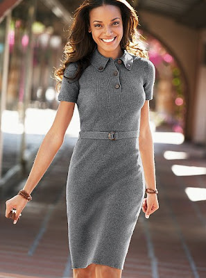
Body By Victoria
Monday, 2 November 2009
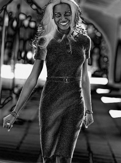
Photoshop Disasters recently featured a wonderfully horrible image from Victoria's Secret.

The first disaster is obvious, which is what makes it so wonderful. The model used to be holding a handbag, now she is just holding the straps. In fact, the handbag could be their Ostrich-print logo satchel, stud tote, or embossed leather tote -- all have the same kind of straps.
What is more fun is how the artist erased the bag. Notice how the ground is made of red tiles. The tiles are square... except where the handbag used to be located. Clearly the artist did not pay attention to detail since they forgot the grout when they copied in the tiles.
Error Level Analysis
In this case, the ELA shows a couple of things. First, the entire dress was modified. If you visit their web site, you have the option to select a dress color and they digitally add in the color. So the color of the dress is not original.
The ELA also has high values on her eyes and mouth. Those were digitally enhanced. This coloring also shows up in the 2nd and 3rd principal components. Basically, the artist brightened her teeth and tweaked her eye color.
2nd Principal Component
More interesting is the high error level that outlines the entire model. The model was "cut out" of the picture. (We'll get to the "why" in a moment.)
Finally, the entire image has a purple-red pattern around it. That strongly indicates the use of a drawing tool like Gimp or Photoshop. Photoshop generates more of it than Gimp, so this image was likely modified with some version of Photoshop.
Luminance Gradient
With this image, there are a lot of things that stand out. For example, the background is blurry. The artist artifically blurred the background. But they didn't stop there. You can see the crisp edge that runs all around the model. This is the cut-out line that was seen in the ELA. In order to blur the background, they had to select it first -- that was done by selecting around the model (the cut-out). First they cut her out, then they blurred the background.
It is subtle, but the LG also shows the edges of the missing handbag. Just look for the vertical edges coming down.
Of course, the blurred background and missing handbag are just the beginning. All surfaces should have similar lighting. If her face is dark on one side and light on the other, then her arms should have the same pattern. However, this isn't what we are seeing. None of her body parts have proper lighting. For example:
 Principal component analysis, 1st component.
The large squares at the bottom of her dress and in the background are from a JPEG resave. (They also exist on her face, but that was washed out when I applied the histogram.) So those areas were modified and then saved as a JPEG. However, the rest of her dress contains no rectangular artifacts -- those were touched up.
And speaking of touched up... notice the round dark artifact on her chest. JPEG artifacts are rectangular, not round. That is where the artist removed her nipple. (My gal friends tell me that she should have worn a padded bra.)
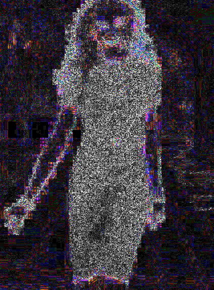
The min/max values of the image identify one other manipulation. Normally these dots should look like random noise. There should be no visible patterns in real images. In this case, her face, hair, arms, and dress all have different noise patterns. This matches the other findings that indicate that her dress, face, and limbs were all digitally modified.
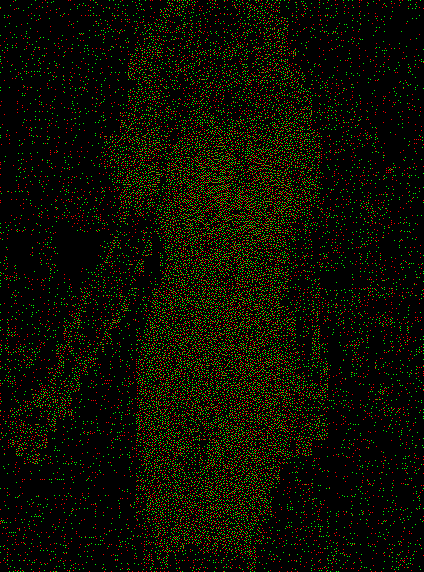
Min/max measurements of image noise levels.
Although the dress appears to have a random noise pattern, there is actually one area where there is a well-defined pattern: her chest. Between her breast the dots form a well-organized "stretch" pattern. The modification also appears in a demosaic analysis as a diamond-shape distortion in the middle of her chest, and in the 2nd principal component as a minor color variation. Digital enhancements usually appear in multiple image analysis tests, and this appears in min/max, PCA, and demosaic analysis, among other tests.

Demosaic modification analysis
Not only did Victoria's Secret not like her skin tone, arm flab, and handbag, they also did not like her chest. They digitally enhanced her bust. Compared with the other image of the model, this image appears to be at least a cup larger. (Insert witty pun here.)
Update: After a few days of criticism, Victoria's Secret changed the image and left in the handbag. The new image is analyzed and compared with the original at: The Secret is Out.
Update: Frequently asked questions regarding this blog entry are discussed at Body of Answers.
The first disaster is obvious, which is what makes it so wonderful. The model used to be holding a handbag, now she is just holding the straps. In fact, the handbag could be their Ostrich-print logo satchel, stud tote, or embossed leather tote -- all have the same kind of straps.
What is more fun is how the artist erased the bag. Notice how the ground is made of red tiles. The tiles are square... except where the handbag used to be located. Clearly the artist did not pay attention to detail since they forgot the grout when they copied in the tiles.
Just One More Thing
I have a theory that I call the "Just One Principle". Simply put, when someone modifies an image, they never change "just one thing". Since the artist at Victoria's Secret erased the handbag, they must have changed something else. What else was modified?Say Yes to the Dress
The images at Victoria's Secret are fairly low quality -- JPEGs at 85%. However, just because they are low quality does not mean we cannot see what was modified. For example, the Error Level Analysis (ELA) should have all objects at roughtly the same coloring. If anything stands out as bright white, then it was the last thing modified since it is at a higher potential error level than the rest of the image.Error Level Analysis
In this case, the ELA shows a couple of things. First, the entire dress was modified. If you visit their web site, you have the option to select a dress color and they digitally add in the color. So the color of the dress is not original.
The ELA also has high values on her eyes and mouth. Those were digitally enhanced. This coloring also shows up in the 2nd and 3rd principal components. Basically, the artist brightened her teeth and tweaked her eye color.
2nd Principal Component
More interesting is the high error level that outlines the entire model. The model was "cut out" of the picture. (We'll get to the "why" in a moment.)
Finally, the entire image has a purple-red pattern around it. That strongly indicates the use of a drawing tool like Gimp or Photoshop. Photoshop generates more of it than Gimp, so this image was likely modified with some version of Photoshop.
Slight of Handbag
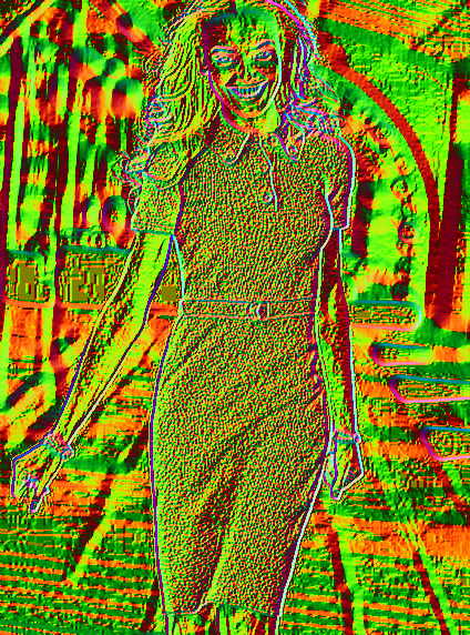
The Luminance Gradient is the most meaningful for this image. LG shows a high degree of manipulation all over the place. With LG, the entire image should contain bumpy noise and jaggy lines. If you see smooth blurs or straight edges, then you are likely seeing digital manipulation.Luminance Gradient
With this image, there are a lot of things that stand out. For example, the background is blurry. The artist artifically blurred the background. But they didn't stop there. You can see the crisp edge that runs all around the model. This is the cut-out line that was seen in the ELA. In order to blur the background, they had to select it first -- that was done by selecting around the model (the cut-out). First they cut her out, then they blurred the background.
It is subtle, but the LG also shows the edges of the missing handbag. Just look for the vertical edges coming down.
Of course, the blurred background and missing handbag are just the beginning. All surfaces should have similar lighting. If her face is dark on one side and light on the other, then her arms should have the same pattern. However, this isn't what we are seeing. None of her body parts have proper lighting. For example:
- Her left arm (photo right) has a light arc near the elbow. While most of this arm looks correct (realistic bump pattern), the elbow lighting looks wrong.
- Her right arm (photo left, holding the invisible handbag) was totally modified. There are no dark regions in the LG. The arm was likely recolored. Also notice the area under her bicep, above the elbow. The edge contains two sharp double curves. This is from a digital manipulation -- the model must have had a little bit of arm flab and the graphic artist tried to touch it up. The result created a dark region in the LG that looks like two arcs under her arm -- like a wide shark bite.
- The coloring on her face is uneven; her forehead does not match her cheeks, and her chin is also different. Looking closer, the gradient shows a ridge on her forehead that should not be there. And her eyes lack the dark/light gradient coloring. The artists completely recolored her face.
| 
|
We Must, We Must...
The first principal component is great at identifying JPEG artifacts from resaves. These appear as rectangular patterns aligned on an 8x8 or 16x16 grid. I have generated the first principal component and applied a histogram to brighten it up.
Principal component analysis, 1st component.The large squares at the bottom of her dress and in the background are from a JPEG resave. (They also exist on her face, but that was washed out when I applied the histogram.) So those areas were modified and then saved as a JPEG. However, the rest of her dress contains no rectangular artifacts -- those were touched up.
And speaking of touched up... notice the round dark artifact on her chest. JPEG artifacts are rectangular, not round. That is where the artist removed her nipple. (My gal friends tell me that she should have worn a padded bra.)
The min/max values of the image identify one other manipulation. Normally these dots should look like random noise. There should be no visible patterns in real images. In this case, her face, hair, arms, and dress all have different noise patterns. This matches the other findings that indicate that her dress, face, and limbs were all digitally modified.
Min/max measurements of image noise levels.
Although the dress appears to have a random noise pattern, there is actually one area where there is a well-defined pattern: her chest. Between her breast the dots form a well-organized "stretch" pattern. The modification also appears in a demosaic analysis as a diamond-shape distortion in the middle of her chest, and in the 2nd principal component as a minor color variation. Digital enhancements usually appear in multiple image analysis tests, and this appears in min/max, PCA, and demosaic analysis, among other tests.
Demosaic modification analysis
Not only did Victoria's Secret not like her skin tone, arm flab, and handbag, they also did not like her chest. They digitally enhanced her bust. Compared with the other image of the model, this image appears to be at least a cup larger. (Insert witty pun here.)
Update: After a few days of criticism, Victoria's Secret changed the image and left in the handbag. The new image is analyzed and compared with the original at: The Secret is Out.
Update: Frequently asked questions regarding this blog entry are discussed at Body of Answers.
I would find it fascinating to find out about those.
Your posts are great.
Principally because I'd like to run a similar sort of analysis on the "wolf photo" making the rounds, here:
http://socialtech.ca/ade/misc/wolf_full_size.jpg
It'd be interesting to see a pro disassemble that image as well.
http://untamed.co.uk/miscImages/doggie.jpg
Cheers,
Dan Derenthal
1) Will a Luminance Gradient correctly differentiate Bokeh (blur from out of focus photons) from digitally applied blur?
2) It sure seems like the more high frequency noise in a region, the brighter it becomes in the ELA analysis. But high frequency signal occurs in real life -- the dress is bumpy.
3) On the second PCA image, the artist obviously altered her knees and the dress right above. Why aren't these white?
4) You're detecting a pattern of warping. But actual dresses warp too. How can you differentiate?
Obviously the image is photoshopped to all hell, but I'm a little skeptical that your image processing is yielding exactly how it was.
Great questions. Let me address each of them.
1) Will a Luminance Gradient correctly differentiate Bokeh (blur from out of focus photons) from digitally applied blur?
Great catch. Luminance Gradient will catch it to a degree.
If there is no scaling involved, then LG can definitely tell a natural blur from an artificial one due to a lack of noise.
However, if there is scaling, then the averaging process can remove noise. The more extreme the scaling, the less noise means more blur.
In this case, there is noise between the blurred sections. (Look for the tiny bumpy pattern between the smooth areas.) If the blurring was strictly due to scaling, this would not occur.
Not mentioned in the blog write-up (simply because this blog entry was way too long): I cross-checked the blur with GPD. Gaussian Pyramid Decomposition is great at distinguishing real blurs from artificial. In this case, the echo lines are present, so I can measure the blur radius. For more info about GPD, see:
http://www.hackerfactor.com/blog/index.php?/archives/297-Blurring-The-Truth.html
2) It sure seems like the more high frequency noise in a region, the brighter it becomes in the ELA analysis. But high frequency signal occurs in real life -- the dress is bumpy.
ELA is impacted by high contrast colors (e.g., zebra, or opposite ends of the YUV spectrum), but not high frequency noise. With a camera original, there is actually a ton of HF due to noise CCD/CMOS sensors. Each resave as JPEG reduces the amount of HF -- regardless of whether it comes from texture or CCD.
But there is one exception: Photoshop does this weird frequency manipulation when saving JPEGs. This can make fine lines appear to have a higher error potential. (I swear it looks like Photoshop uses DCTs to scale the image larger and then reduce the image size before saving. This emphasizes fine lines and also generates that purple-red rainbowing.)
If the high ELA was due to high frequency modifications by Photoshop, then the fine lines in the hair would appear at the higher level. In this case, the hair (which is in focus) is at a lower error potential. Also, the buttons on her dress and the dress' uniformed color area by her thighs are both at high levels when they should be much lower. (With the lower button, it consumes most of the 8x8 grid, yet the entire grid is at a higher error level. If this was frequency based, then that square should be high, but not as high as its neighbors. The smoothed fabric area should all be low. It is low compared to the dress, but much higher than the background.)
3) On the second PCA image, the artist obviously altered her knees and the dress right above. Why aren't these white?
PCA measures distance from the primary color space (the gamut). Basically, if you plot every unique color's RGB as xyz, then you get a cloud shape. The cloud for a natural picture (particularly with resaves) should be like a flattened football. The longest axis is PC1, PC2 is the 2nd longest axis, and PC3 is the third longest axis (with PC1, PC2, and PC3 all being perpendicular).
What principal component #2 (PC2) is showing is that the white on her teeth is very far from the cloud. It should be near the cloud. Same with the eyes.
The knees are not white in PC2 because the coloring is near the PC2 axis.
With color detection and PCA, a distant color (particularly with resaves) can be identified as abnormal, but a near color is inconclusive with regards to manipulation.
4) You're detecting a pattern of warping. But actual dresses warp too. How can you differentiate?
The min/max and demosic algorithms look at overlying color and noise structure. These are independent of the conceptual texture.
With min/max, it identifies the highest frequencies that are impacted by scaling and resaves. An unmodified image should have the same pattern (or near-same) across anything that is not uniformly colored. And since it detects noise patterns the noise should be everywhere and in the same quantity. (In my extended image analysis presenation, I've got some great examples of min/max where you really cannot make out anything, even though there are many different textures.) In this case, the dress has a very different noise pattern, and it has parts that do not appear random. (With min/max, any manipulation will distort the min/max points and generate structure.)
Demosaic analysis looks at the relationship between adjacent colors. That 2x2 RG/GB grid that is originally used to take a picture creates a relationship between adjacent pixels. This relationship is actually maintained through scaling and blurring. But if you draw on a picture, then you break this relationship.
(As an aside: TV broadcases rebuild a color relationship, so it takes a very artificial coloring for a TV screenshot to appear artificial through a demosaic analysis. Want to make a fake image pass the demosaic analysis? Pass it to a video capture card and then take a screen shot.)
As far as coloring goes: the faded purple in the upper left is not unexpected. That is not suspicious. The strong red/blue striping on the right is suspicious. (The white was made whiter, but since it is uniform inside the object, a color relationship exists between all pixels inside the outlines.)
However, anything white means that the relationship is totally broken. In this case, the dress, outline around the woman, and eyes/mouth all break the relationship. (Make sense: they cut her out and blurred the background.) The dress colors lack any kind of relationship with the RG/GB coloring. The dress colors actually lack a relationship with any of the common demosaic patterns: RGGB, BGGR, GRBG, YCMG, GMCY, etc. (10 total). The dress color is artificial.
Now for the cool part: even with the artificial coloring, there is still "some kind" of relationship with the coloring of adjacent pixels. Even though I do not know what the relationship is, I do know that the warping breaks it.
When I first saw that diamond, I thought "whoa!" So I went to Google Images and search for "ribbed shirt" and "stripped shirt" (both searches NSFW). There are plenty of examples of shirts over well-endowed women and models (and some fat guys) -- some pictures are real, some enhanced. With demosaic, the artificial (warped) ones had clear diamond patters, while all of the real ones (regardless of scale) lacked it. I also photographed some of my own shirts (I own some ribbed polo shirts). If I digitally warped the fabric, demosaic would identify it. But if I physically stretched the fabric then (regardless of scale) demosaic would not notice it.
Dan: excellent questions. Thanks!
And since I wanted to ask the same thing, here goes: what tools are you using for this? Builtins or plugins for Gimp or PS, or something else (of your own making)?
TIA
René
I'll be doing a reply to common questions in the near future.
However, I think she looks MUCH better with the darker skin. I wouldn't have lightened it. Bad move on VS’s part and one that will surely have people pulling the race card out.
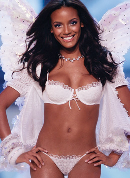
Victoria's Secret does not employ hundreds of models. They only have a few active models at any given time. I believe this particular model is Selita Ebanks. Moreover, I believe that both pictures are the same person.
Specifically: None of the other VS models look similar to either picture. In contrast, there are pictures of Selita Ebanks that look that each of these pictures. For example, this picture has the same facial expression and facial attributes as seen in the invisible handbag photo, but she has a different skin coloring:
http://islandista.files.wordpress.com/2008/06/selita_ebanks.jpg
This other picture shows her head at an angle. You can see a similar partial smile, the sharp cheekbone above the sunken cheek, pronounced chin, long dimples, and narrow nose.
http://www.veryglamour.com/pics/2006/Winter%20Wonderland%20of%20Glacial%20Goddeses/Selita%20Ebanks.jpg
(Don't get too hung up on the eyebrows -- they are drawn in with an eyebrow pencil.)
Having said that, if you can positively identify a different person, then I will certainly retract that portion of the blog entry.
Please check more closely next time.
I've changed the comparison image to one found on a Selita Ebank's fan site.
Is is possible the background was naturally out of focus? Or perhaps the artist just blurred it more?
Yep, you could use a Lens Blur or a Shape Blur, in PhotoShop / After Effects.
http://photoshopdisasters.blogspot.com/2009/11/wgate-demi-moore-demi-anja-rubik.html
The easy giveaway (without using tools): the tassles, groin cloth, and skirt/wrap are totally different, with no sign of a blur.
(It's coincidence that both women are scary thin, were photographed at similar angles, and look like meth users in that dress.)
Second, some people care a lot that we are subjected to impossible, unreal, images that we form our ideas about "what people look like" from. It's widely believed that many women have self-image problems because of this practice. The question of what changes are actually being made is fairly important to any rational discussion of this issue (as are other factors).
Picking on images that have been retouched solely for the web is definitely easy. They usually have a higher number of images with a lower budget. Also, because of their lower budgets, you usually get less experienced retouchers working on them. Or the more experienced retouchers will cut many corners as they know the money is not there to do it properly.
Fashion retouching in general is easy to pick on. (Vanity Faire covers are HORRIBLE) Usually as their turn around/budget is relatively fast/low to many other advertising markets.
I would be curious to see how these analytics work on an image that has been worked well by a professional with time & money. Looking at both a high resolution print image (TIF), as well as a scaled down version of the same saved out for the web. I would like to see what was caught and what was missed of all edits done.
Also, every image in advertising has been retouched. All of them. Some may be as minor as giving it more contrast and adjusting color, to a full creation of the image from multiple sources.
Are you saying that given enough effort an image could be altered without leaving tell-tail signs?
If yes, then no wonder that pictures taken with digital cameras are currently not admitted as evidence in a court of law.
I hope the answer is yes, since pretty soon there will not be any more pictures taken on film.
hha
Analogue photos can also be manipulated, (retouch, rephotograph (oooh! now I have a negative to 'prove' the image is valid) print) so the risk of manipulation exists whether you use a digital image or not.
Courts ask the officer who photographed a scene (or item, person, etc.) if they were the person who took the photo, and if the photo is a reasonable/accurate representation of what they saw. That's the test.
Of course, someone could lie. But that's an inherent risk of any legal system, and if you think people don't lie in court, well, you probably don't know the meaning of the word 'naive.'
These tools will be very useful if and when digit pictures are used in a court of law...
keep it up.
Along another line I was wondering if you could detect the same changes if I took a screenshot instead of saving - or even if I took a digital photo of the picture on my screen?
What is more common is for a JPEG to be saved to a PNG or other format. Those types of file conversions are very distinct since a PNG should not contain JPEG artifacts. Going the other direction is more difficult: from PNG to JPEG, you can only tell that it started from a lossless image format. But something like JPEG to PNG to JPEG (without any edits) should look identical to a JPEG resave (JPEG to JPEG).
I was looking into these forensic techniques as a means of avoiding having to digitally watermark video frames, but I don't know how they would hold up to this "re-saving" technique.
Most likely an intern, web graphics person, or the AD themselves did the ham-handed handbag removal and clone job. This is what happens when people who are also little more than hobbyists have to get their pixels dirty on a deadline.
Also, not all of the background was blurred. The bokeh is still perfect around the station lights (this was shot at the LA train station), but the ground would come into focus around her hips, which must've been distracting.
But what if all came from RAW files from a good cameraalways resaved as png ?
next step
Then suppose i just project, or make a big print of the final result, and using something as a camera phone or a cheap camera a make a photo of it...taking care to have a slight off focus
You will still able to detect the edited part ?
While this is an impressive analysis I doubt that there is a way to interpret the results without having a lot of expertise on the matter, so it's not really only a question of having the tools available to you...
Good job!!
--th
As a photographer I don't have too much issue with many of the edits made to the image. Things like tweaking the eyes, teeth, skin and such are simply what you do to complete images of people in fashion, advertising and portrait photography. Indeed - clients will complain without many of these little tweaks. I've spent hours, for example, retouching images of glasses wearing subjects where a glare on the lens ruins an otherwise great photo.
I think it's instructive to deconstruct images from high profile ads. As another commenter noted it reminds us of how much these images can diverge from 'reality'.
Were this journalism or news reporting, however, any such tweaks would be unethical. Images can evoke powerful feelings and manipulated images presented as news is wrong and manipulative. Recognizing those transgressions is what exercises like this are particularly useful for.
Really, why would anyone get excited about the fact of alteration in a commercial shot. It's done all the time and has been done even back in the since fashion and commercial photography has been in existence. Not sure what the point of this is. I don't think anyone who has half a clue about photography would be surprised by any of this. Was it just being able to say, ah ha, I've got V. Secret?
It isn't photojournalism.
If I may, I would like to take a shot at answering the person who asked if you could avoid detection by these tools by using a screen cap of an image. These tools, collectively, are visualizing the anomalies introduced by the various editing procedures, by repeated JPEG save operations, and by the interaction between them. It's sort of like fingerprints: if someone doesn't leave any, or wipes them all away perfectly, then there won't be any to find no matter what tool you use. If you did a screen capture of a full resolution view, or converted a JPEG to a lossless format, all of the clues would still be there as would all of the pixel information from the JPEG. If you performed some sort of operation that changed every single pixel, or captured a screen that was redrawn at lower resolution, it probably would remove at least some of the clues (I suspect that re-quantizing or dithering the image, or using a "smart blur" function, would eradicate most of them). Unless several images were composited, all from the same source, and all lossless, odds are that some clues would remain, and that one or more of these analysis techniques would locate or emphasize them. I, for one, would see great value in an application that made versions of these techniques available, all in one place, and optimized for image forensic analysis, without having to dig into something like MatLab and do them all by hand. Being able to show edits and tampering "automatically" and mathematically, without resorting to "taking the word of some expert with a good eye", makes the results accessible to people like forensics experts (and juries).
On another note entirely, I would be interested to see what shows up on repairs done with the new "content aware patch" tools in Photoshop CS5. Those use replacement content "intelligently composited" from elsewhere in the image; I wonder what wonders they wreak on the results.
https://infohost.nmt.edu/~schlake/ela/
Anyway, really great analysis!
Also, could it be that the "cut out" line you see is the result of the model being heavily back lit.. producing a white edge everywhere, and cleary
showing the hairs of the arms?
Also, black people have an amazing skin quality, which reacts heavily to the light setting; comparing a photo taken outdoor and one at a show is pointless.
Maybe you shouldn't believe everything you see in ads, but you can't believe everything here either.
The straight edge is not due to lighting or background. I cover this in the Luminance Gradient section of my conference paper.
You might want to also read a few other blog entries I have written:
http://www.hackerfactor.com/blog/index.php?/archives/346-Body-of-Answers.html
I show some of the original skin color that the artist forgot to recolor.
http://www.hackerfactor.com/blog/index.php?/archives/297-Blurring-The-Truth.html
How to distinguish a real blur from an artificial blur.
And it actually is easy to create an artificial bokeh quality in Photoshop.
http://abduzeedo.com/awesome-digital-bokeh-effect-photoshop
The very principle of a shallow DOF, is that with a large aperture, every light ray not on the focus plane will take many more pixels then it would if it were on the plane of focus, and will take the shape of the blade of the lens.
Motion blur on the other end, basically just registers different images on top of each others; in your case, they're in the same focus plane, which is infinite, so yes, every point in real life would take exactly 1 pixel.
Please post an analysis of a picture, with an extremely shallow DOF (APF says it was taken at 200mm f2.8 which yields a pretty fine DOF), then we would be able to discuss your article properly.
It's absolutely not easy to recreate bokeh.
Bokeh isn't only about a few simple light spots that are covered in the PS tutorial (and I'm sorry it's still a far cry from a real one) but it affects everything in a manner you would simply have to take insanely huge amount of time to recreate: in our case, the reflections on the window, the light on the pavement.
I'm not trying to poop on the party, but I found some very misguided statements in your other posts relating to terrorism and Iran. You made many statements of fact that I suspect to be false. This likely stems from an undeserved trust you have in establishment sources and so-called "experts."
You have used certain skills to awaken to the trickery of the state (fraudulent evidence), yet seem to embrace the remaining evidence.
The post where you attack Paul Joseph Watson and defend IntelCenter ignores the growing pool of evidence that the US is producing these fake documents. Looking at it from a forensic economist perspective, only the US and their secret allies stand to gain while the "terrorists" gain nothing.
Didn't mean to drift off topic their. Hoping to enlighten.
Thanks, for the interesting article.
And as a personal note - I like the color on photo number 2 much better! Grrrrrr!
I'm not sure why you could not chose a pic you actually had sources. Perhaps you have an issue with V-secret advertising? Please, advertising is all about projecting an image ... when I wear shiny shoes and a pressed suit to a job interview, I am conning the employer into believing me to be more than I really am. This sort of deception is everywhere - get over it.
In this blog entry I did a blind evaluation.
You should read the next one in this series:
http://www.hackerfactor.com/blog/index.php?/archives/329-The-Secret-is-Out.html
While Victoria's Secret did not release the original, they did release another variant. The variant is orthogonal in many ways and confirms most of the findings.
With regards to your other comments:
"I'm not sure why you could not chose a pic you actually had sources."
It's called a 'blind test'. In the real world, you usually do not have the sources available.
"advertising is all about projecting an image"
If they just modified her face, arms, and background, I would not take issue with the photo. However, they modified the dress. By modifying the item they are trying to sell, they have created a "bait and switch" situation. This dress will never look as nice on you because you are not photoshopped.
"This sort of deception is everywhere - get over it."
England, France, and even some parts of the United States have recently attempted to pass laws forbidding this form of manipulation. Israel is the first country to succeed in passing anti-photoshopping laws.
http://www.theatlantic.com/international/archive/2012/05/what-the-us-can-and-cant-learn-from-israels-ban-on-ultra-thin-models/256891/
http://www.haaretz.com/print-edition/news/photoshop-law-will-force-advertisers-to-identify-touched-up-images-1.295974